YSDN 4004 Project 1: wordplay
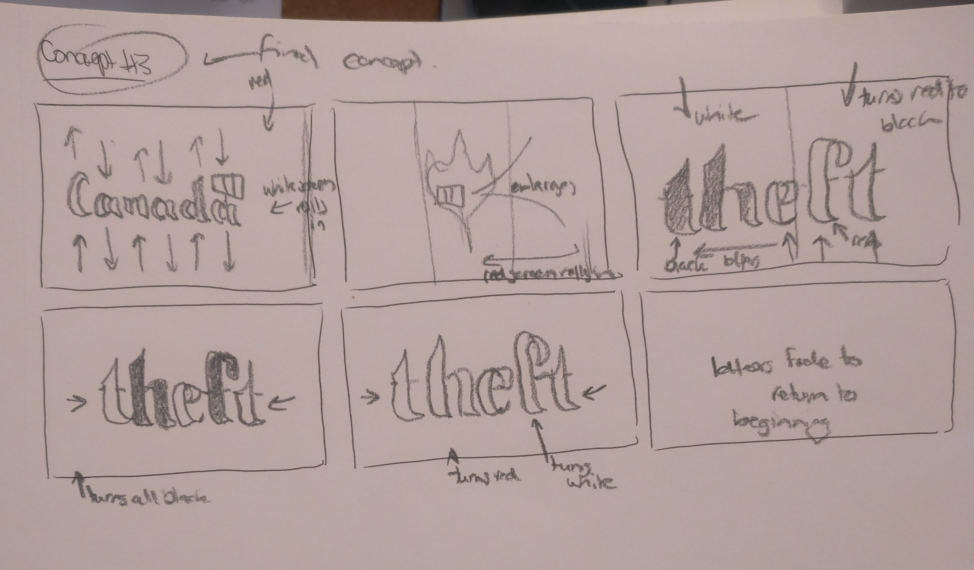
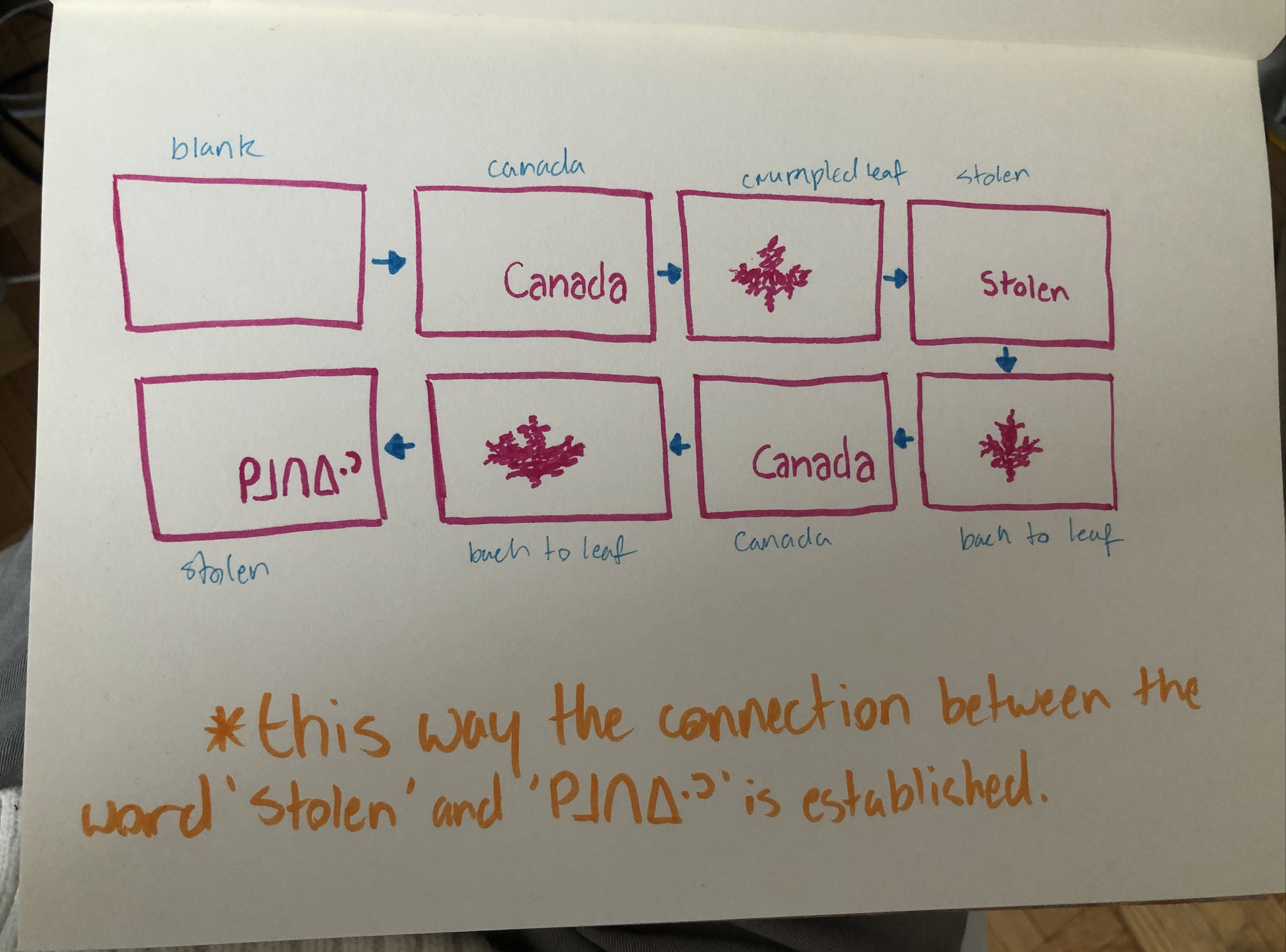
For our first Type in Motion project we decided to go with the subject of colonialism. We went through a slew of words with different connotations like highway & tears, government & assimilation, and pain & injustice, but in the end we ended up going with the words Canada & Stolen. We went with these words because we felt that they provided the most eviceral reaction to the viewer. After we had the words chosen we did some more research into the words. We ended up learning that the Cree word for stolen is kimotiwin (sourced from the Online Cree Dictionary) and tried to incorporate the Cree Syllabic spelling of the word into the video.
Throughout the process of this typographic project, there were a few challenges that posed themselves as obstacles through the process. Through these obstacles, we learned to hypothesize and construct to solve these theoretical, conceptual, and design based problems. To start, the biggest issue we ran into was making the viewer aware that the word kimotiwin was the translation of the word stolen. We didn't want to show the English and Cree translations side-by-side because we felt that it would be a
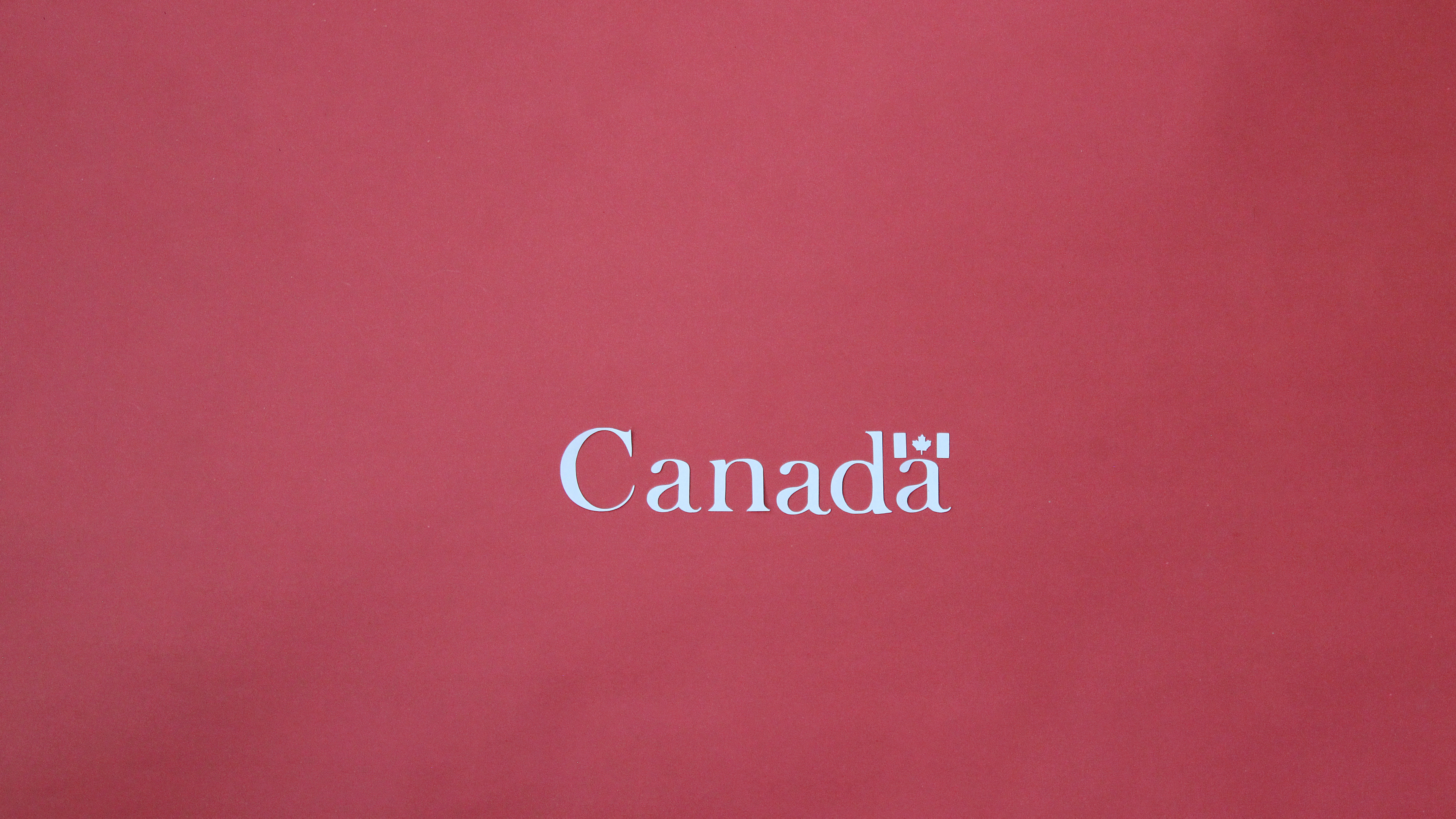
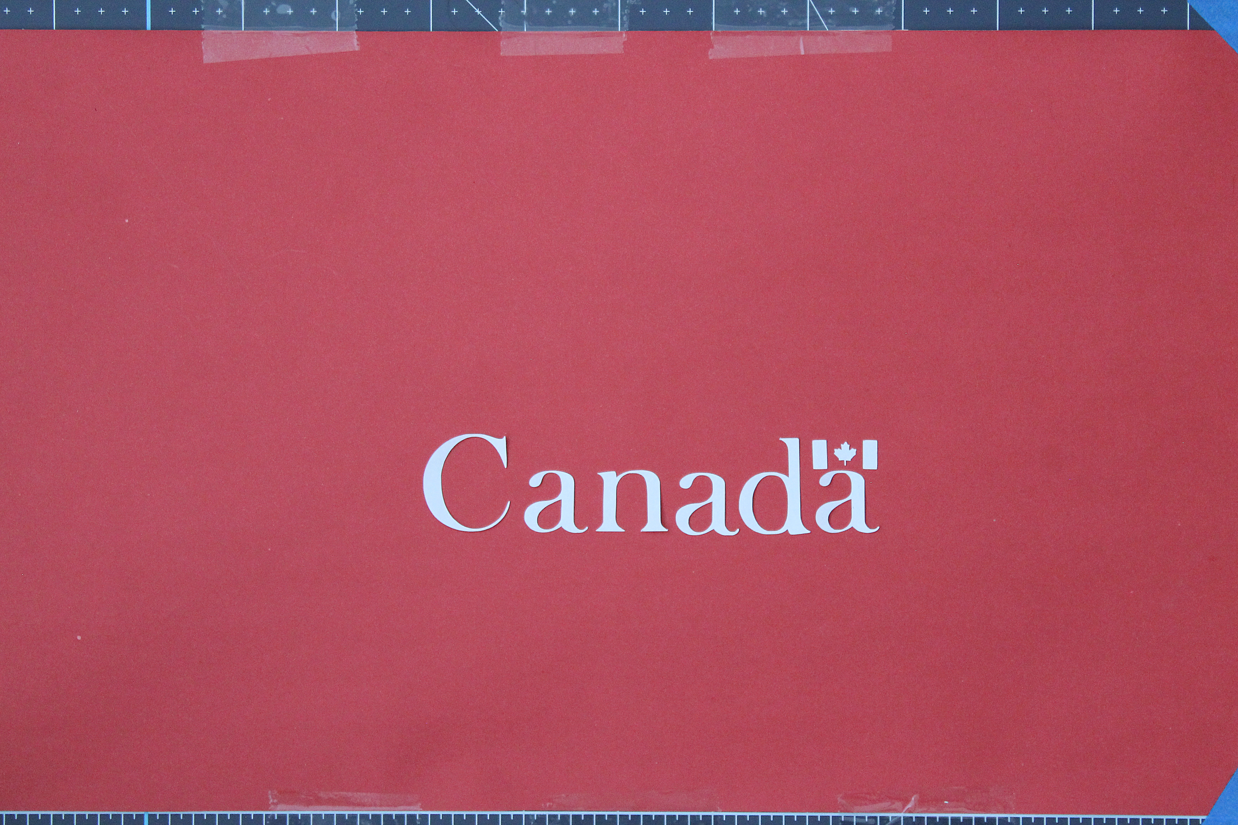
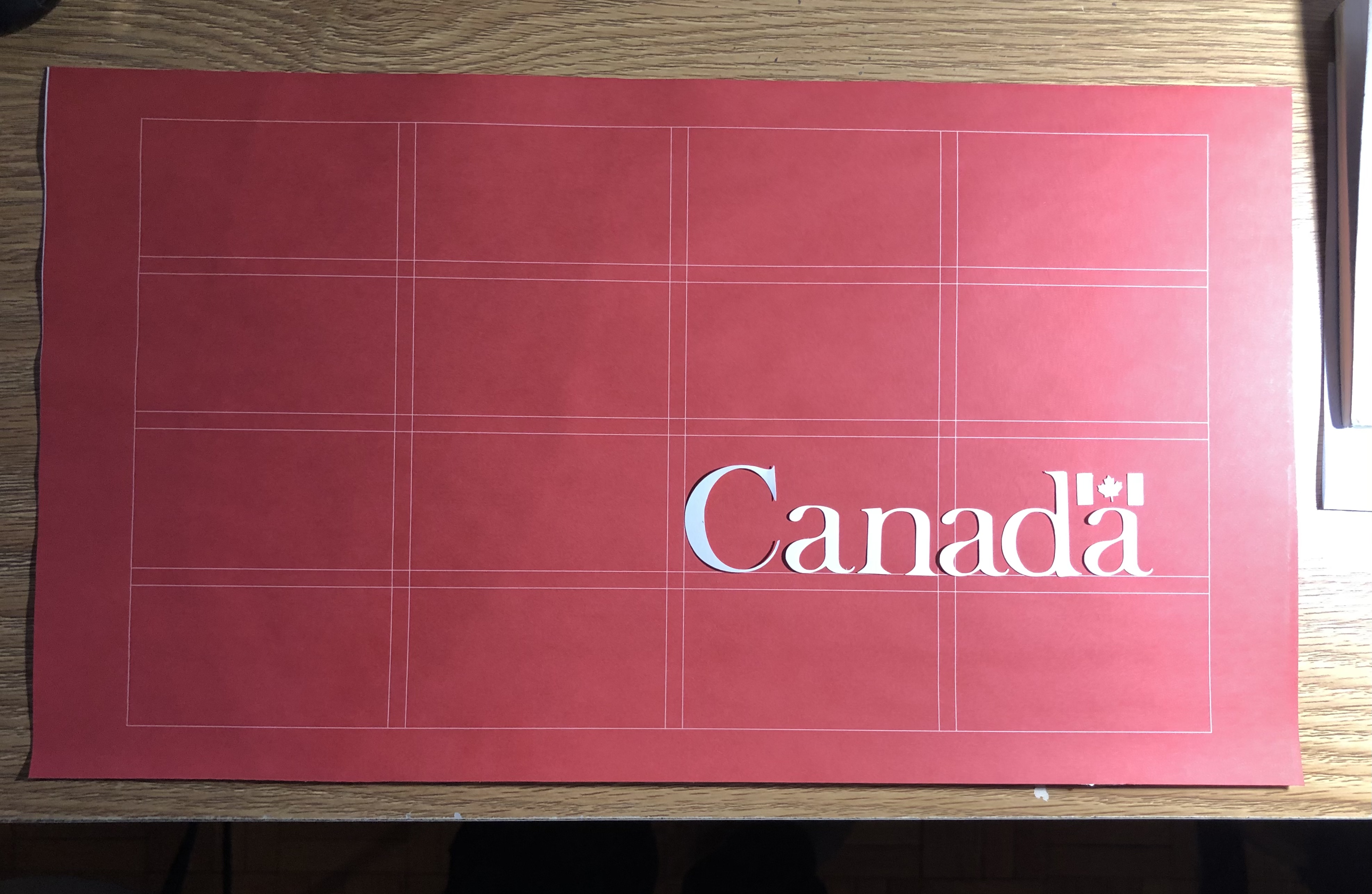
So what we ended up doing was making the composition flip between the English and Cree terms, visually implying that they are the same word. We also opted to use the Canada word mark to symbolically show how a Modernist institution stole the land; as opposed to so called ‘innocent’ settlers claiming the land without thinking about the repercussions. This intention behind the design successfully demonstrated the meaning of the two words and their incorporation into the final design.
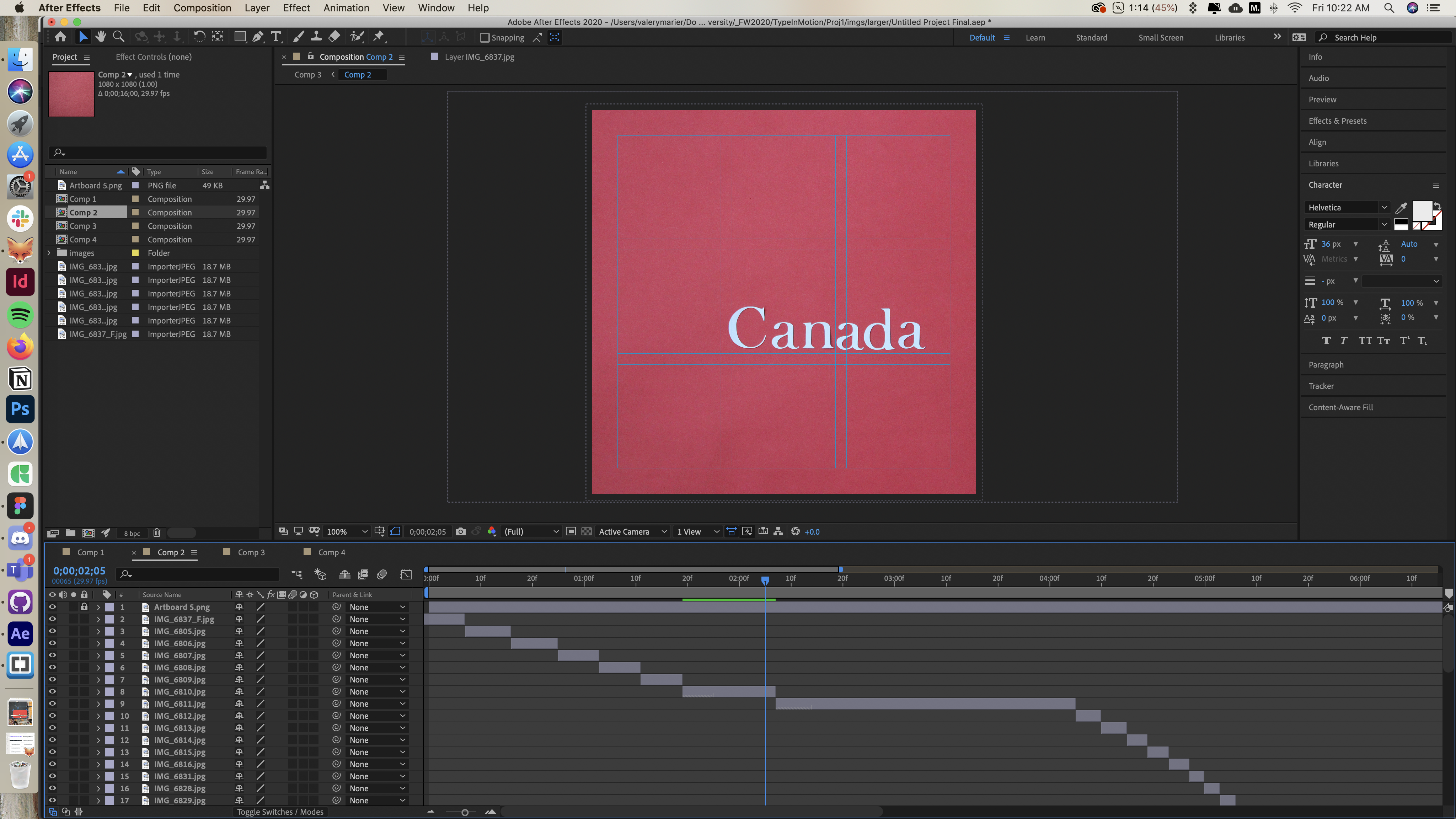
Some other minor issues we ran into or details we had to change include the pace of the final animation, the time focused on each individual key point within the video, and the aspect of repetition within the video. The pace of the final video was changed in order to create more of a sense of flow within the transitions between each separate word, as well as focus a smaller ratio of the entire video on the “in-between” transitions. To add this this, another piece of criticism that we received was to key the timing between the transitional periods and the key periods where the words chosen are displayed, to display the words for a longer period of time, and let the in-between transitions serve as fast transitions that don’t take up a significant amount of camera time, in order to make the composition more successful and valuable.
Additionally, there was also a repetitive aspect within the rough cut of the video that needed reworking, being the aspect of repetition of the maple leaf sequence between each word, which was unnecessary and took up way too much camera time through the whole composition. The video was condensed, and a few of those repetitions were removed, and instead of fading the word to a leaf to a word back to a leaf to a word, the leaf was faded to a word and then to the next word.
Overall, through these various obstacles and challenges, and after receiving a variety of tips and constructive criticism, the final project, shown above (at the top of the webpage) made for a successful result that shows visual interest and significant intent, using the two words, Canada and Stolen.
The biggest issue we ran into was how to make the viewer know that the word kimotiwin was the translation of the word stolen. We didn't want to show the English and Cree translations side-by-side because we felt that it would be a cop-out. So what we ended up doing was making the composition flip between the English and Cree terms, visually implying that they are the same word. We also opted to use the Canada word mark to symbolically show how a Modernist institution stole the land; as opposed to so called ‘innocent’ settlers claiming the land without thinking about the repercussions.