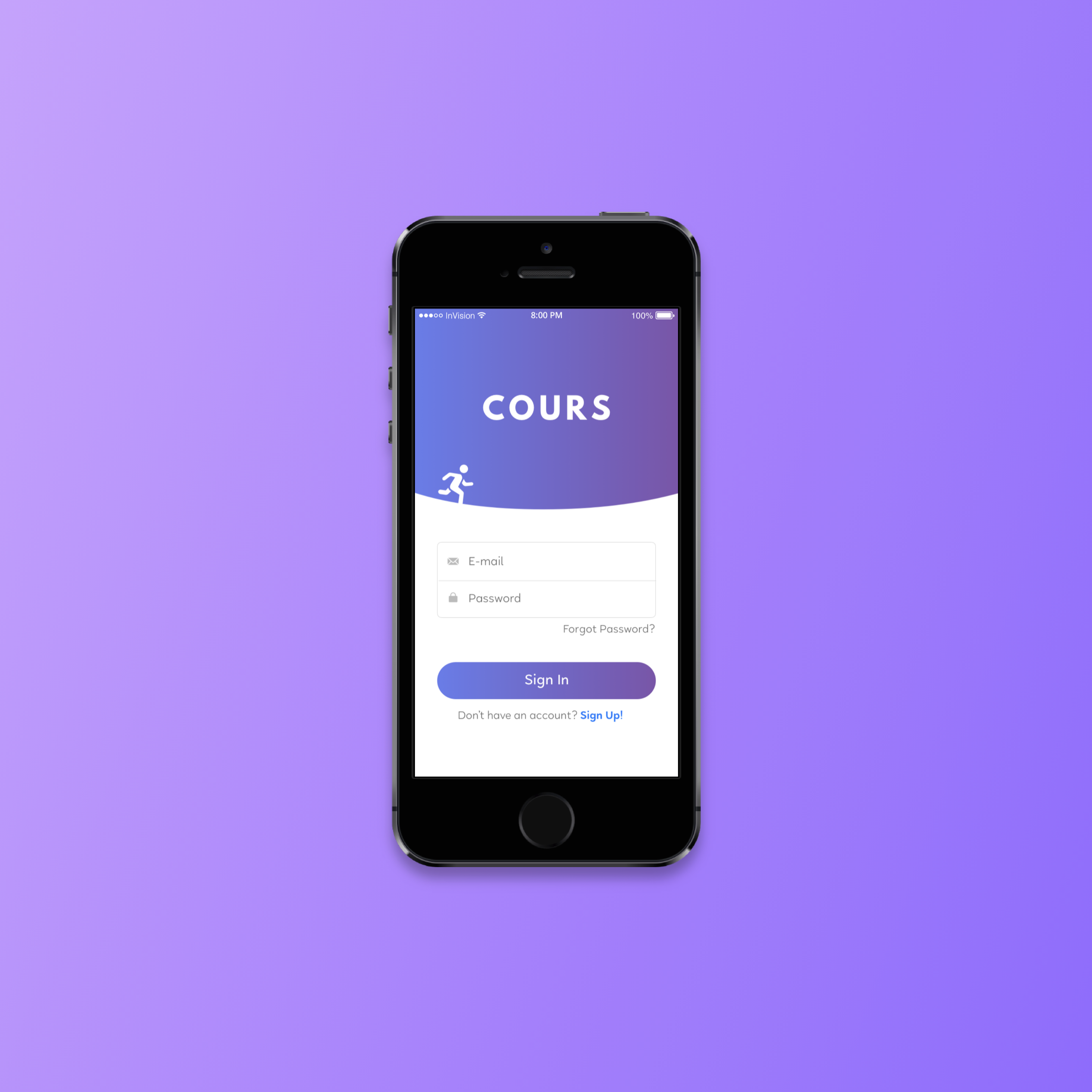
Cours is an app that helps you run better.
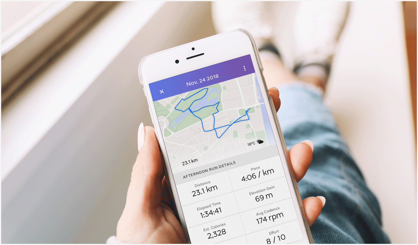
Cours is a running app concept that was designed with runners in mind. I created it with simplicity, functionality, and self improvement in mind. At its core, Cours is a running app that doesn’t just track you, it coaches you too. Cours provides core runners with training guides and workout recommendations that are modified to fit their needs based on their activity.

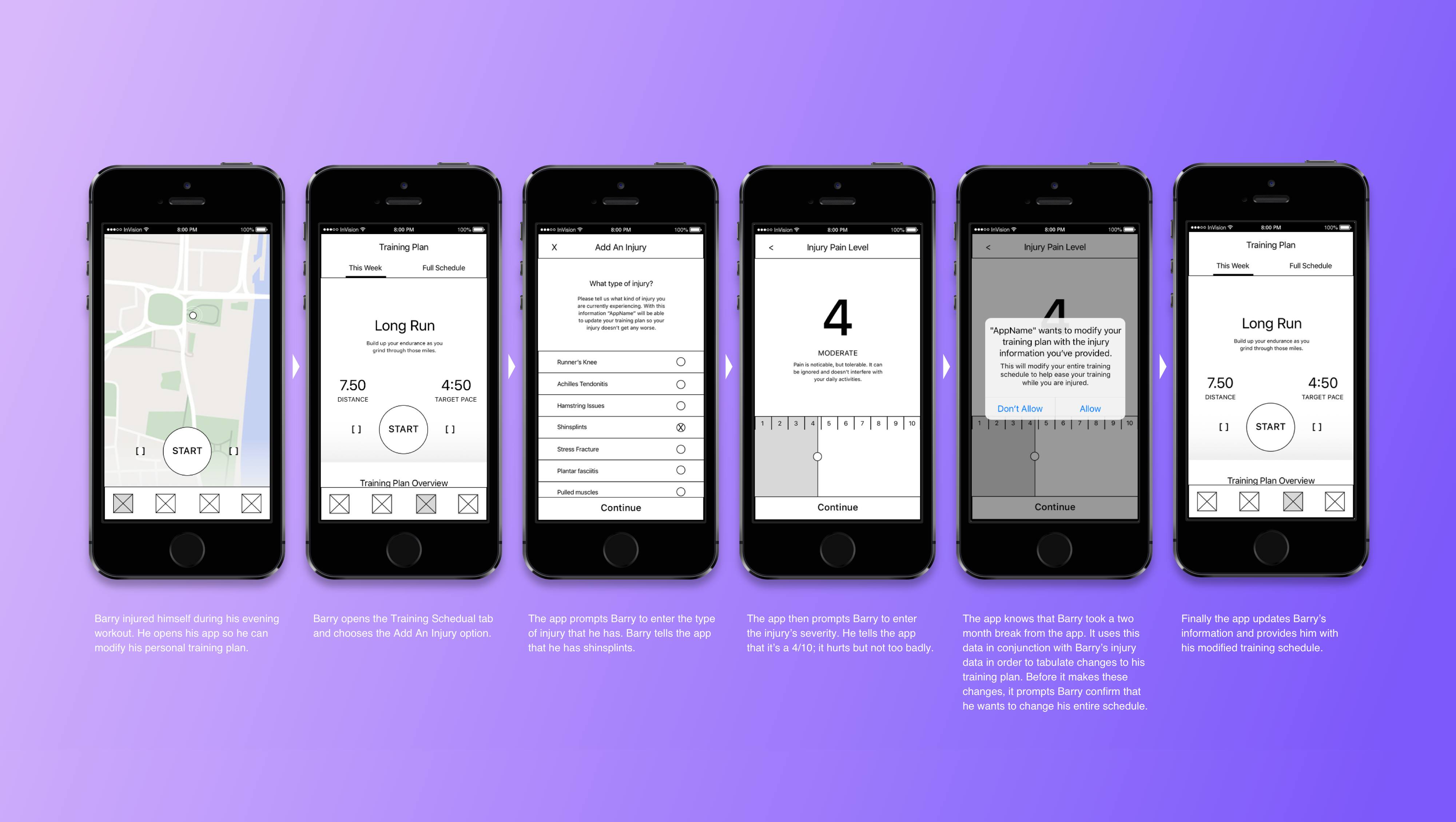
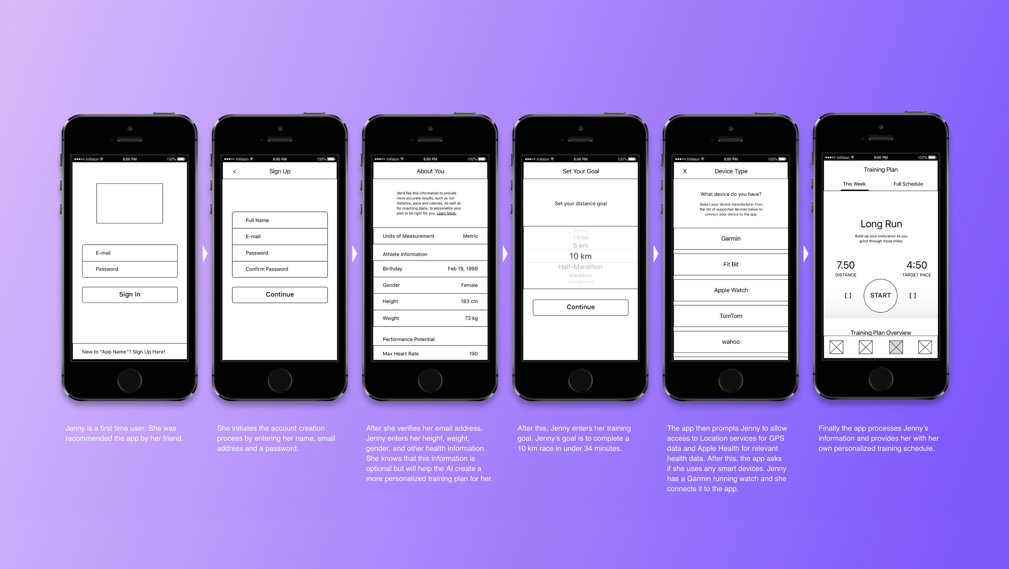
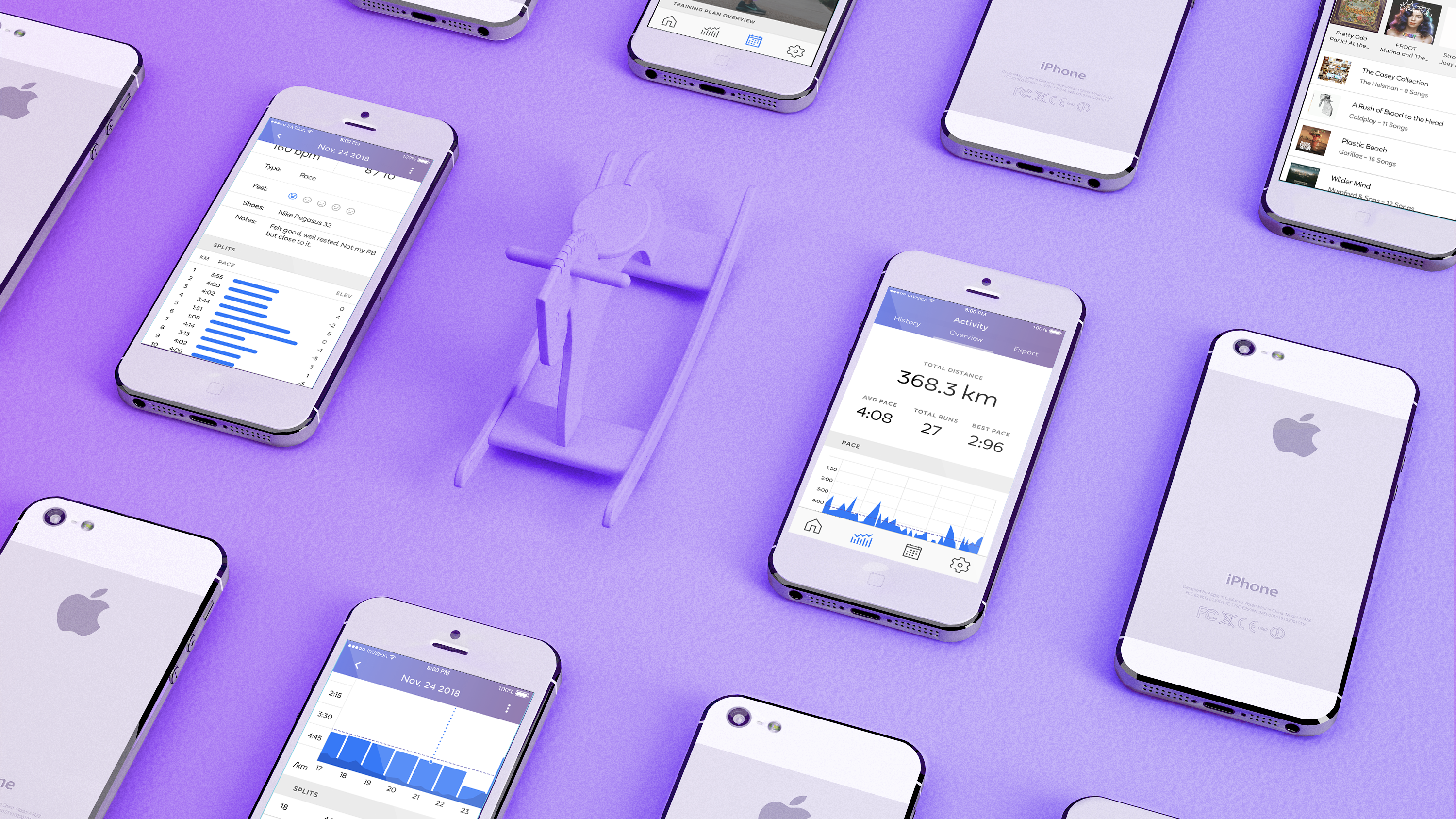
Cours keeps track of a runner’s average pace, stride, cadence, splits, heart rate, elevation, heart rate, and heart rate zones. Also Cours’ training plans are based on user’s skill and experience. It is not a one size fits all app, this app allows users to input their average pace, experience level, etc, in order to get a specialized schedule suited to their specific situation. The app the user also has the ability to input injuries and get recommended training schedule changes. They are able to set short and long term fitness goals. They get daily motivation through kind user reminders of their goals. The app would have end-to-end encryption; only you have access to your data. Cours also has the ability to export the data from a user’s runs into spreadsheets.
The planning phase of this project involved two stages: iterations of the app’s user flows and planning the visual identity of the app. First I started with several very rough hand drawn user flow charts. Then I choose the best parts of each flow chart, and I began loosely sketching—to scale—barebones wireframes for the most important screens of each flow. This helped me to get a feeling of what the layout would look like on a real iPhone. Eventually I decided on a rough layout for each page I began to organize all of the app’s data as per the iOS Human Interface guidelines. After I digitised the wireframes, all that was left to do was to apply the visual identity on top of the wireframes.
