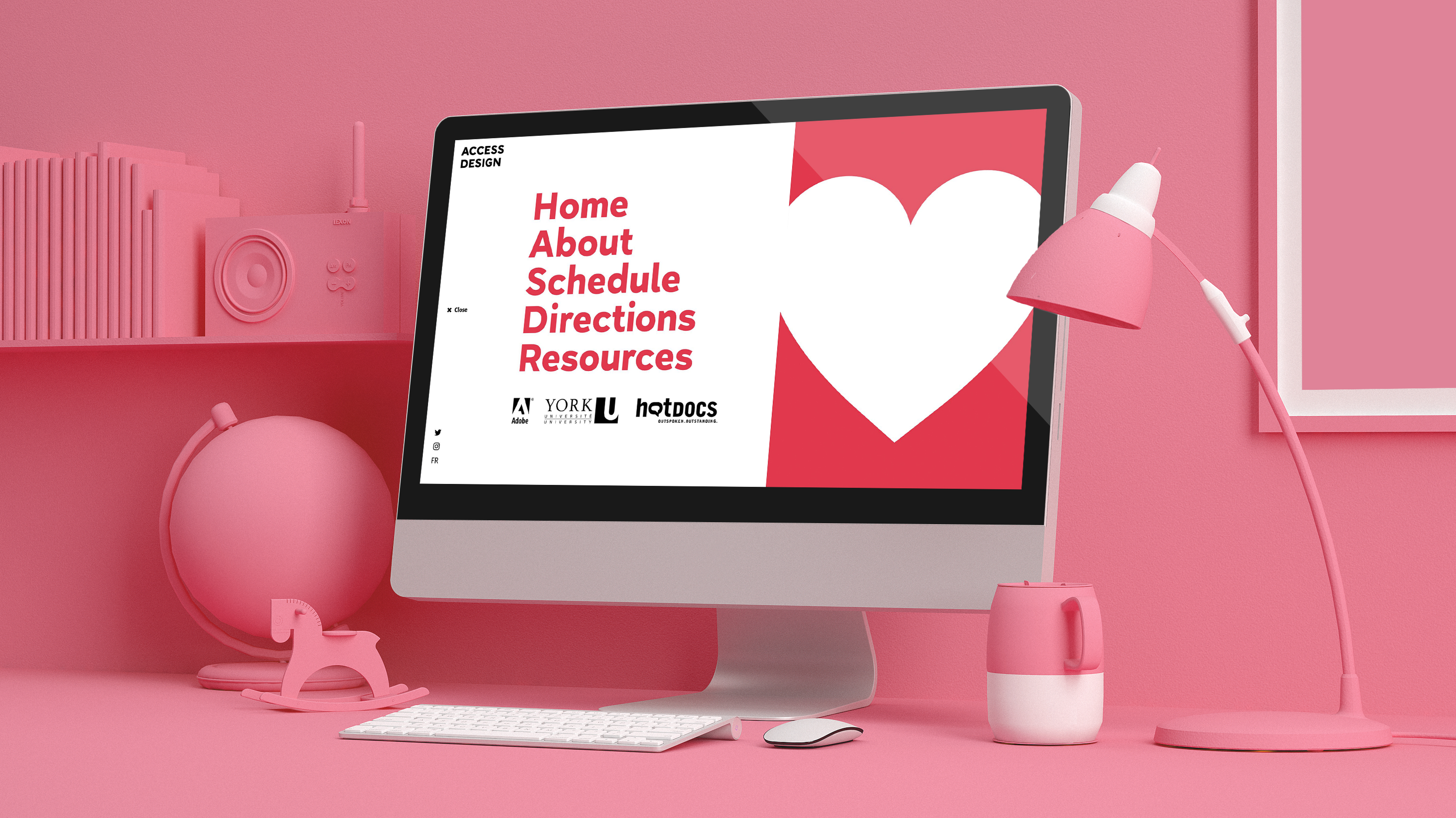
Access Design is a festival identity project that has a focus on accessible design.
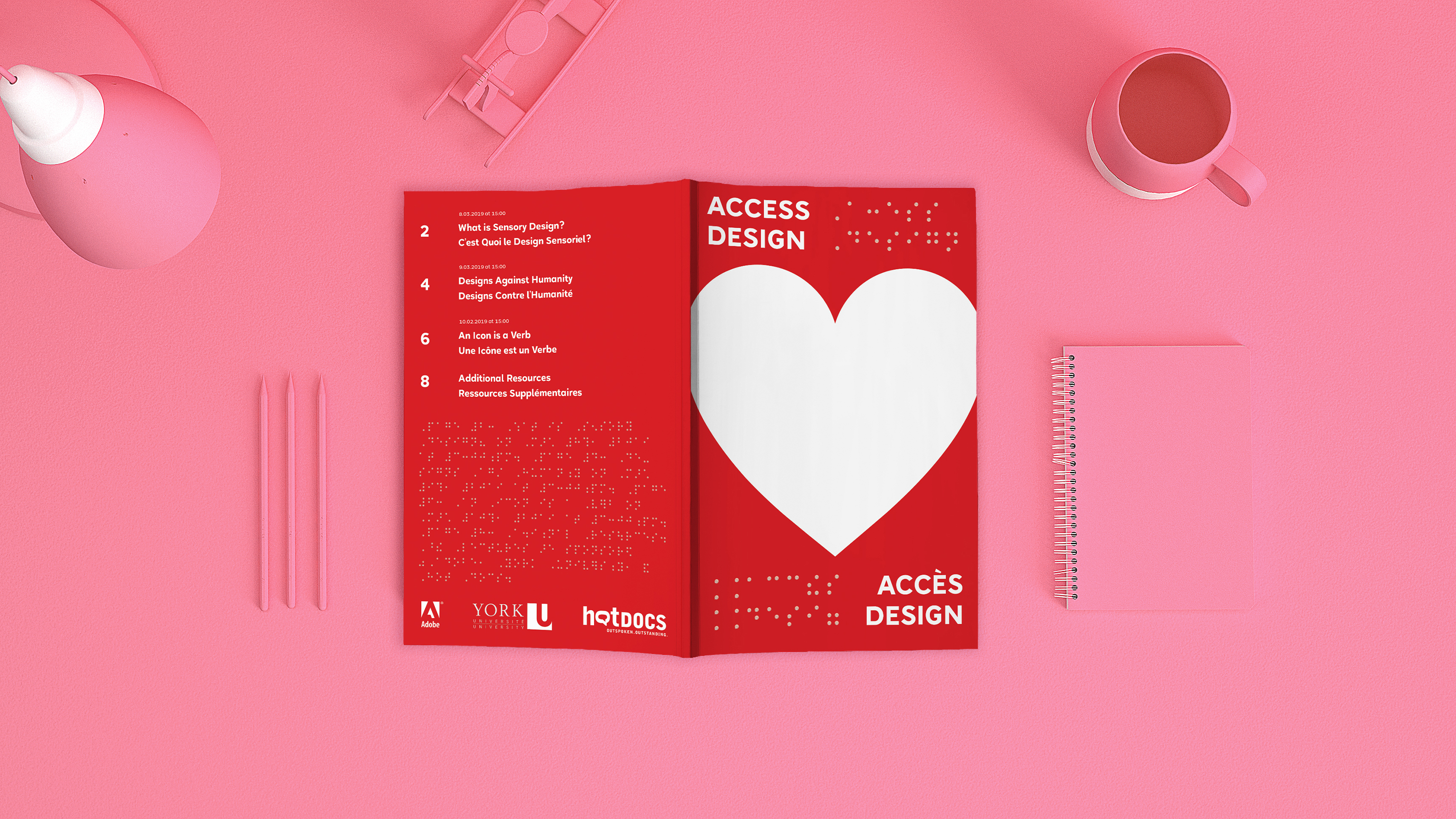
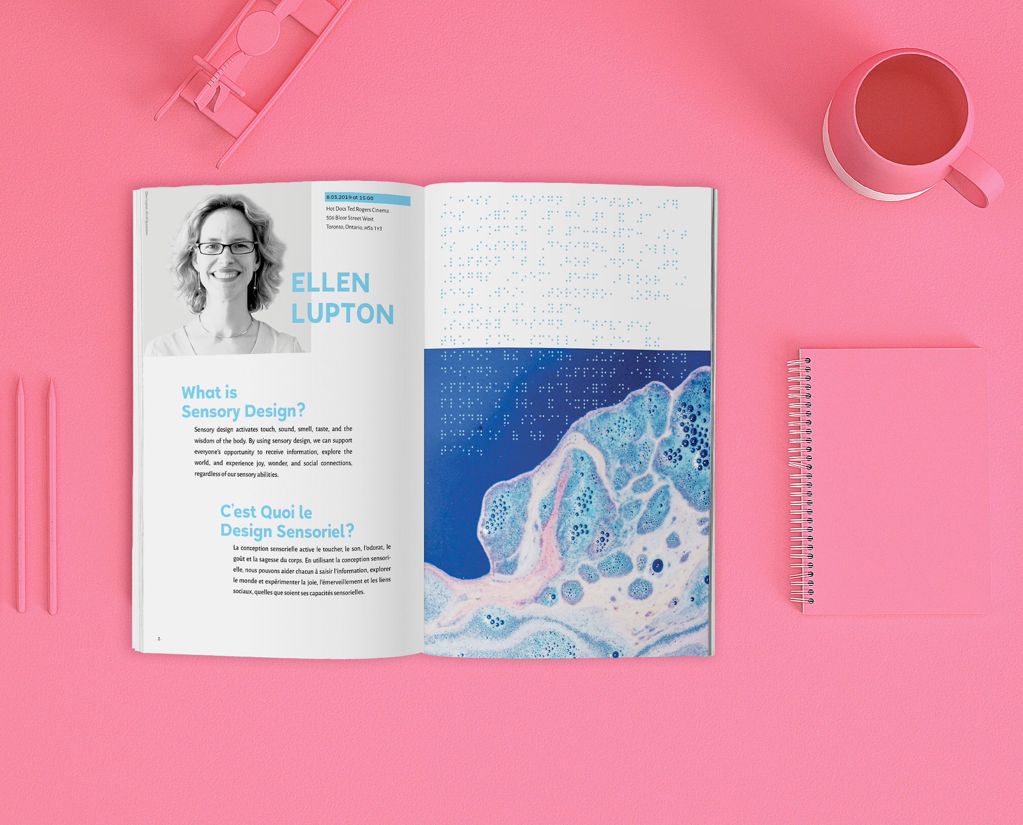
Access Design is an experimental typesetting project where I set out to prove that there was a way to blend the braille script with the Latin script in print without sacrificing the look and aesthetic qualitiy of the piece. The booklet portion of this project won the RGD Bold Award for accessible design in 2019. I also was tasked with creating an accompanying website, which migrated the visual quality of the book into digital form. I took a brutalist inspired approach to the layout not only because it was visually interesting — the sharp edges and defined text blocks created an interesting contrast to the smooth braille dots — but also because I wanted to make a visual omage to the brute force approach of grassroots activism of the past that put accessibility in the public eye.
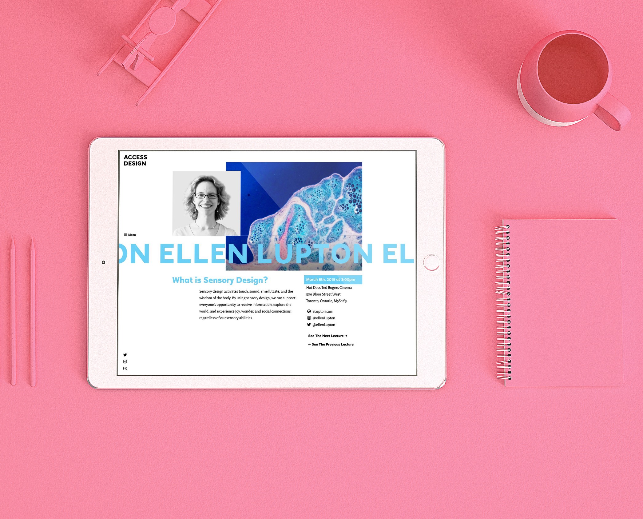
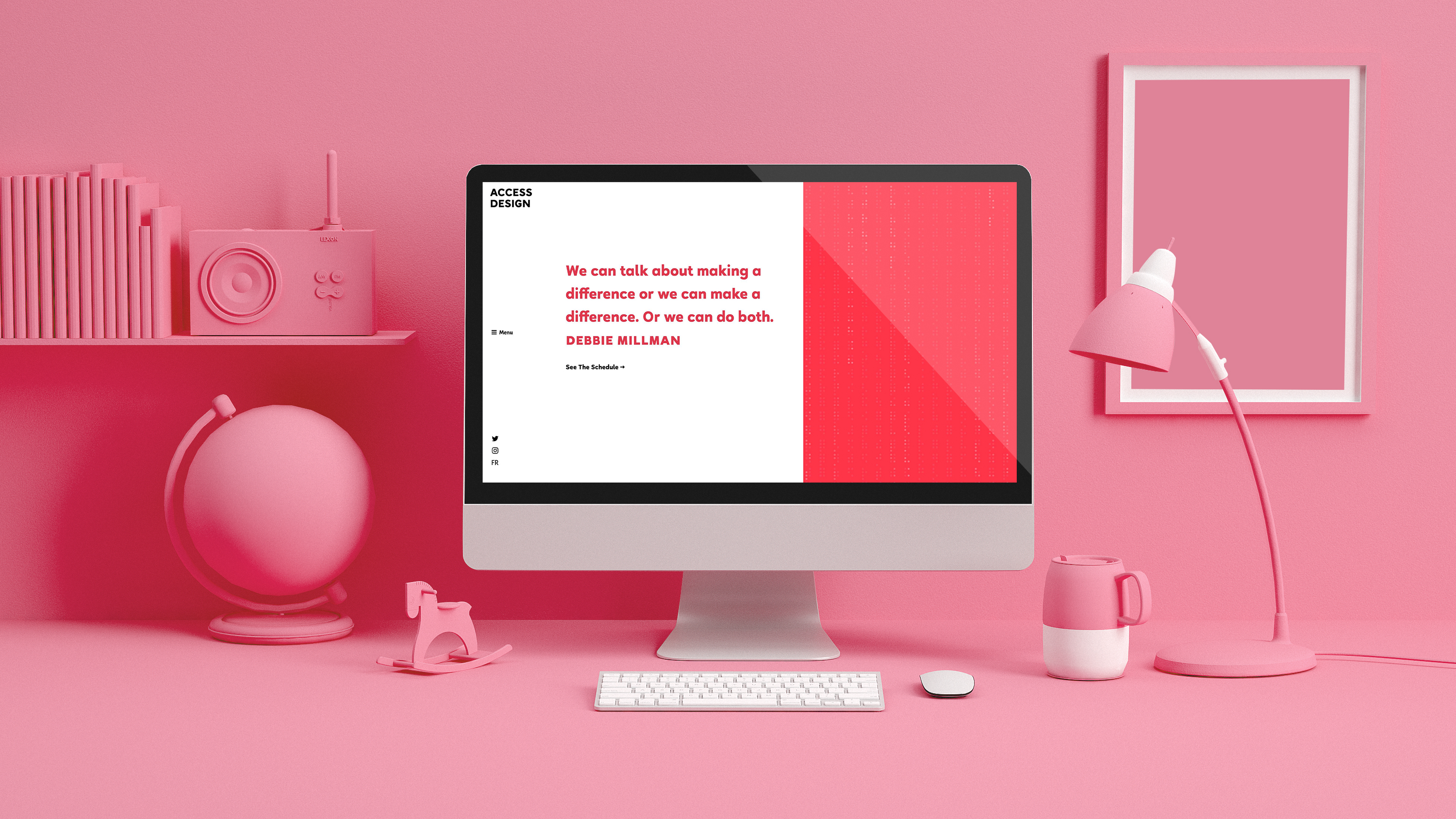
For the website I had to reinterpret the layout because having actual braille type on the event's website would be redundant; braille readers are able to interpret regular text digitally. I decided to keep the braille dots as a visual reference to the booklet, and I created a subtle accent animation with. Instead of utilizing different colours or underlines for accents and links, I opted instead to use motion to show text links as a nod to the tactile nature of the booklet.
The concept is clean, bold, well thought out and multisensory. The rationale and detailed consideration around the typographical pairing and genre selection are on point, as the humanist style embodies many of the traits that make a typeface legible.
