A Field Guide to Web Accessibility is exactly what it sounds like; a basic starting guide to accessible web design.
During my studies in university I came to realize that, despite having taken compulsory web design courses, many of my peers were still confused about how to go about designing an accessible website and what exactly was required in it. Since I've been designing websites since I was in high school, I figured that I would take my knowledge of web design and combine it with several accessible design resources (ally.css, the RGD Access Ability guidebook, etc) in order to create an easy to consume jumping off point for accessible web design.

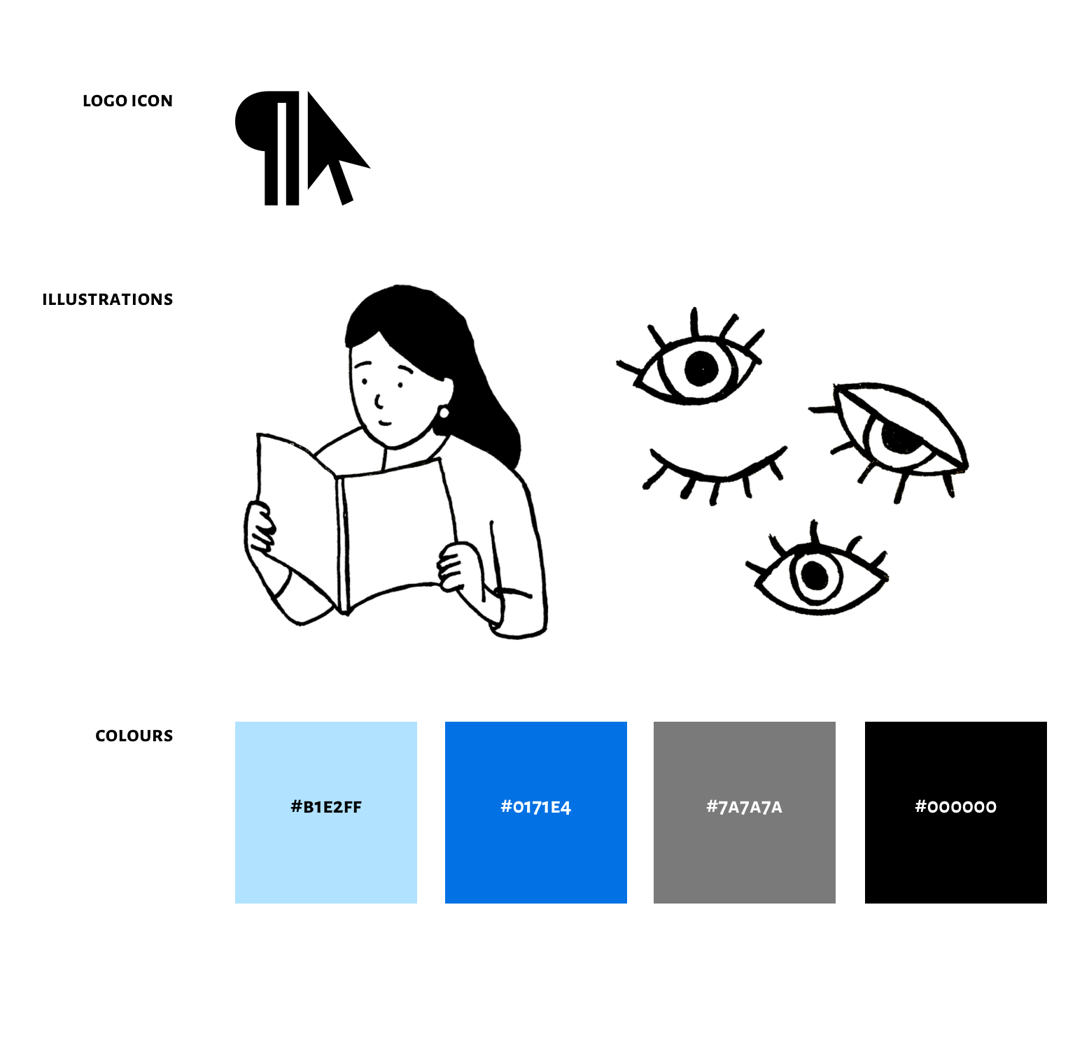
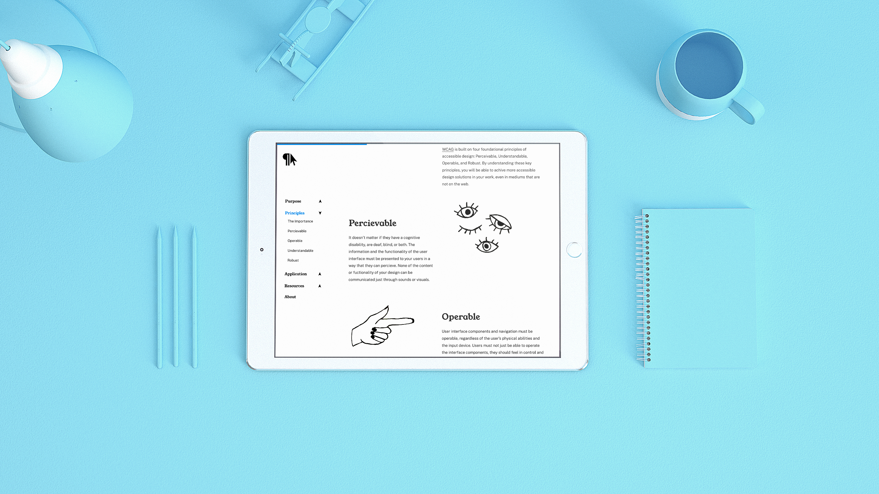
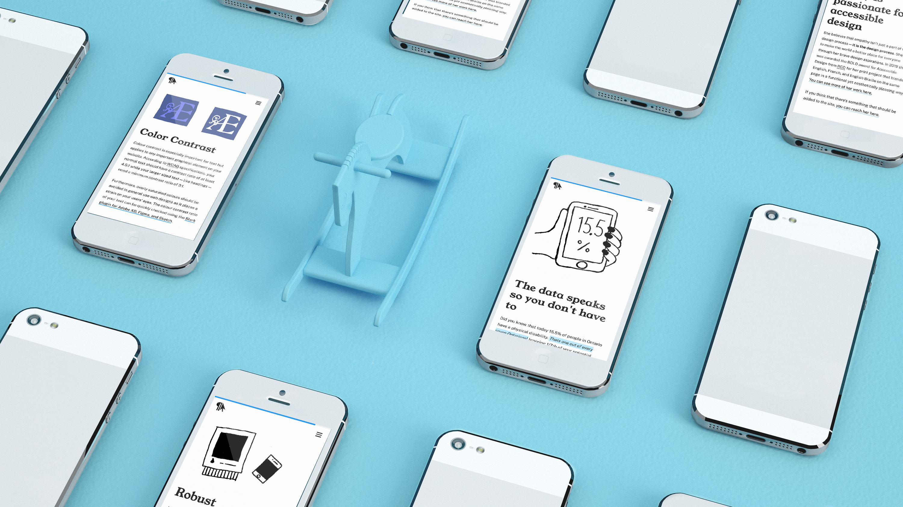
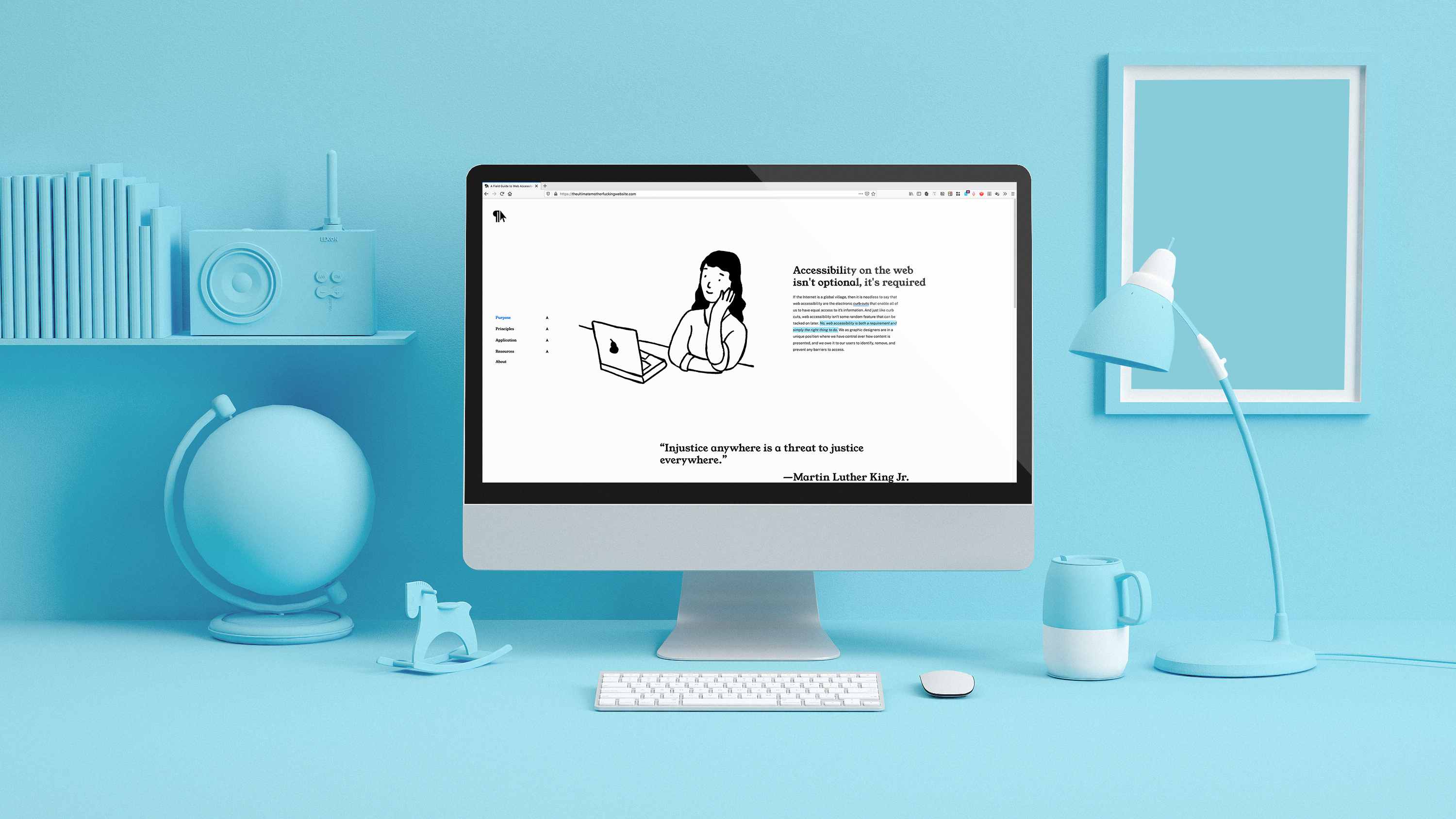
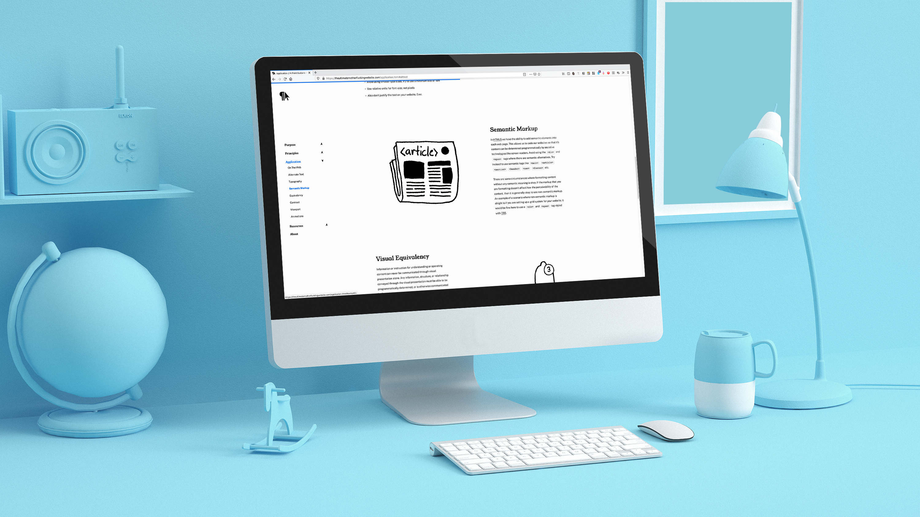
Early on, I made the decision to typeset the website in the variable font Public Sans. I did this because I wanted to experiment with variable typesetting while still retaining legibility across devices. I also opted to use simple playful illustrations throughout the guide, with alternate text of course, to make the guide book feel lighter and easier to consume. The use of blue sparingly throughout the website provides just enough pop without distracting the user from the website's core content. The website is accessible on all modern web browsers and is be WCAG 2.0 Level AA compliant.
Empathy isn’t just a part of the design process—it is the design process.